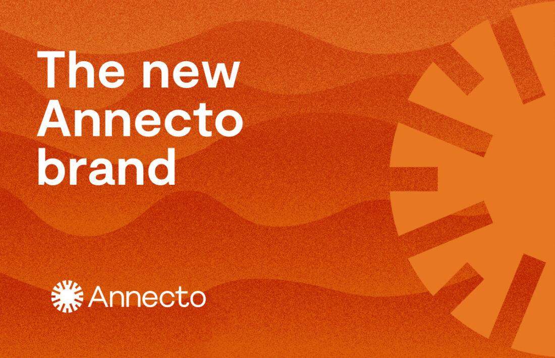
A large number of workshops were conducted with our staff to identify the essence of the organisation, and create this new brand look and feel. The Annecto brand appearance has been carefully designed to reflect our personality, and help us build and maintain a consistent brand that people can recognise easily.
- Why does our brand matter?
Because what you see is what you get – and we want to show that our values are the strongest driver of our work, and the most prominent aspect of our identity. We want the Annecto experience to be warm, real, and courageous; as varied as the lands we operate on, and as bright as the sun that lights our way. We celebrate real people, in real communities, with real stories. We’re here to build honest connections – and the courage and warmth to see that connections have a broader impact on our vision of a just and inclusive society. It takes guts to stand against the expectations that limit us. We hope the boldness of our new brand captures that bravery.
- What do our logo and colours mean?
Our new brand is full of vivid colours inspired by Australia’s nature and landscapes, paying respect to the diversity of communities we work with across the country. Our sun logo evokes the strength and hope of our mission, and represents a yarning circle, which allows us to elevate the stories of everyone we support in our journey towards a more inclusive and just society.
- How does the brand reflect our practice framework and values?
Our new brand identity also expresses how we live and breathe our values:


Authenticity - when we say it, we do it. We aim to be genuine, honest and accountable, which means taking responsibility for our actions and choices.


